Published · 6 min read
Art for Modern Interiors: Choosing Work for a Minimal Room
One strong work or a grid, scale on a large white wall, frames that disappear, and light that holds — how to choose art for a modern, minimal interior.
A minimal room is unforgiving in a particular way. With little furniture and plain walls, whatever you hang becomes the loudest thing in the space. A good choice can carry the whole room; a timid or merely decorative one is exposed in a way it never would be among books, rugs and clutter. Hanging height and fixings are the same in every interior — this is about the decisions that change when the room around the work has been deliberately stripped back.
One strong work, or a composed group
The first decision is structural, and it is worth making before looking at a single image. A minimal interior usually takes one of two approaches well, and something in between badly.
- One work, alone. A single piece on an otherwise empty wall is the most direct statement a room can make. It asks the work to be strong enough to hold attention on its own, and it asks you to leave everything else off that wall — no shelf, no clock, no second small print "to balance it".
- A group read as one object. Several works of the same size in identical frames, aligned and evenly spaced, behave like a single larger piece. This is the grid, and it is the natural way to use editioned prints in a modern room.
Scale against a large plain wall
Modern interiors tend to have more uninterrupted wall than older ones, and the most common mistake is hanging something too small on it. A single 40 × 30 cm print alone on a wide white wall does not look restrained; it looks lost.
There are three honest answers to a big wall. Choose a larger format where one exists — many editioned photographs are offered in more than one size. Build a grid, so that several modest works occupy the space of one large one. Or accept that the wall is too big for a single piece and give the work a narrower surface instead: a pier between two windows, the end of a corridor, the return of a wall beside a doorway. Empty wall is not a failure in a minimal room. A small work marooned in the middle of it is.
Monochrome and restrained palettes
Black and white photography suits modern interiors for a practical reason: it does not have to be matched. A colour work enters into a conversation with every surface in the room — the oak floor, the grey sofa, the terracotta pot — and that conversation is not always a good one. A monochrome image sits alongside almost any material palette without competing.
That does not mean monochrome is automatically calm. Strong contrast reads as graphic and assertive; soft greys read as quiet. Decide which the room needs. Where a colour work is right, a restrained one — a limited palette, large areas of a single tone — tends to hold better against plain walls than a busy one.
Frames that disappear
In a minimal interior, the frame should be the least visible part of the work. Three choices do most of that:
- Thin moulding in black, white or natural wood, chosen to recede rather than to announce itself. A heavy or ornate profile turns the frame into furniture.
- A wide acid-free mat. Generous white space around the image gives it room to breathe and makes a modest print read as a considered object. Acid-free board matters for the long term: ordinary card yellows and marks the paper it touches.
- Anti-reflective glazing. Large windows and glossy surfaces are common in modern rooms, and ordinary glass turns a dark image into a mirror. Anti-reflective glass lets the work be seen rather than the room behind you.
Grids for editioned prints
Editioned photographs are well suited to grids because they typically come in a fixed format. Same size, same mat, same frame, equal gaps: the grid absorbs differences between images and lets you put together works that would look unrelated hung apart. A row of three works well above a long, low piece of furniture; a block of four or six can take a wall on its own.
Keep the gaps tight and exactly equal. In a minimal room the eye notices every irregularity, and a grid that is slightly out is worse than no grid at all.
Open plan and sightlines
Open-plan living removes walls, which means the walls that remain are seen from further away and from more places. Before choosing where a work goes, stand where you actually spend time — the sofa, the kitchen counter, the front door — and look. The wall at the end of the longest sightline is usually the one that deserves the strongest work.
Distance changes what works. An image with a clear, simple structure — a single form against an open ground — reads from across a room. Fine detail rewards close viewing and is better placed where people pass near it: a hallway, beside a desk, next to a staircase.
Light that does the work
Minimal interiors are often lit by general ceiling light alone, which flattens everything on the walls. A dedicated light on the work changes it more than any frame. The figures are the same as anywhere: LED, a colour rendering index above 90, a warm 2700–3000 K consistent with the rest of the room, and aimed at about 30° from vertical so the frame does not throw a shadow and the glazing does not reflect the lamp. For a monochrome print, a low CRI is especially visible: greys pick up a tint that was never in the image.
Texture as contrast
A room of smooth plaster, glass and lacquer can feel flat however good the furniture. Art is one of the few places texture can enter without clutter — the grain of a photograph, the surface of the paper, the wood of a frame, the depth of a mat. Photography that is itself about texture works especially well here, because it supplies what the surfaces around it deliberately leave out.
Three works that suit a minimal room
As an illustration, three signed black and white photographs from ArtMarket, the shop this site links to, each built on a single strong form:
- Celestial Contrast by Serena — described as a billowing cumulus cloud against the stark void of a black sky, with soft, voluminous forms. One shape, one ground: the kind of image that reads from across an open-plan room.
- Elegance in Contrast by Bonaque — a high-heeled shoe captured in sharp contrast against a deep shadowed background. Graphic and spare, it suits a narrow wall or a spot seen from close up.
- Resilience in the Wasteland by LumièreVue — a lone tree in an arid desert, its shadow stretching across dry, rocky terrain. Cracked ground and a single vertical form bring texture into a smooth room.
Each is hand-signed, in an edition of 25 with a signed certificate stating the edition number, printed on premium photographic paper at 40 × 30 cm, with a 60 × 40 cm version printed to order. They are shipped unframed, rolled in a tube, so the framing choices above are yours to make.
Not decoration
The trap in a designed interior is choosing art the way you choose a cushion: for tone, for size, to finish the room. Work picked that way tends to disappear within a month, because it was chosen to fit in. The pieces that last in a minimal room are the ones that hold your attention on their own terms — an image you would want to look at on any wall. Choose for that first, and let the room adapt. In a space with this little in it, it will.
Works mentioned in this guide
Signed, limited-edition photographs listed on ArtMarket, our commercial partner — for when the reading turns into wanting a real print.
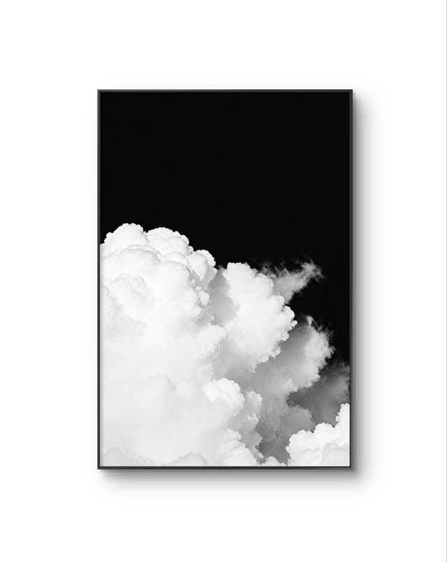
Celestial Contrast
Serena
Black & white photography · Edition of 25 · Signed
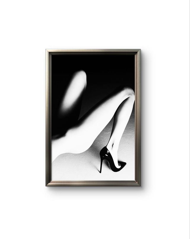
Elegance in Contrast
Bonaque
Black & white photography · Edition of 25 · Signed
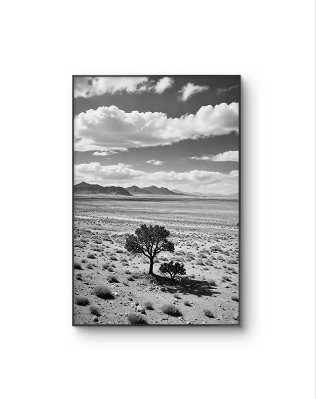
Resilience in the Wasteland
LumièreVue
Black & white photography · Edition of 25 · Signed
Listed on ArtMarket, our commercial partner. Edition details and pricing are on their site.
Continue reading
- How to Frame a 45 × 30 Photography Print: A Practical GuideArt prints ship rolled and unframed. Here is how to flatten, mat, glaze and hang a 45 × 30 photograph without damaging it — and what it actually costs.
- How to Choose Art for Your Home: Wall, Scale and MoodStart from the wall, not the artist: scale against furniture, mood room by room, colour or black and white, light, framing costs and living with a work first.
- How to Start Collecting Photography: A Practical GuideWhat makes a photograph collectable, the print processes worth knowing, where to look in France, how to give a collection a thread and how to buy online.